A Selection of Branding Showcases

Turri Vive, inspired by the immortal jellyfish Turritopsis dohrnii, was brought to life by FMC. From the name to the visual identity, every element was carefully crafted to embody the pursuit of longevity and rejuvenation. The brand reflects FMC’s vision of guiding patients toward timeless vitality through a seamless blend of concept, design, and experience.
The Story
Imagine a creature that defies the very essence of aging—a being that can revert to its youth and start its life anew. This isn’t science fiction; it’s the reality of the Turritopsis dohrnii, the ‘immortal jellyfish.


The Pattern
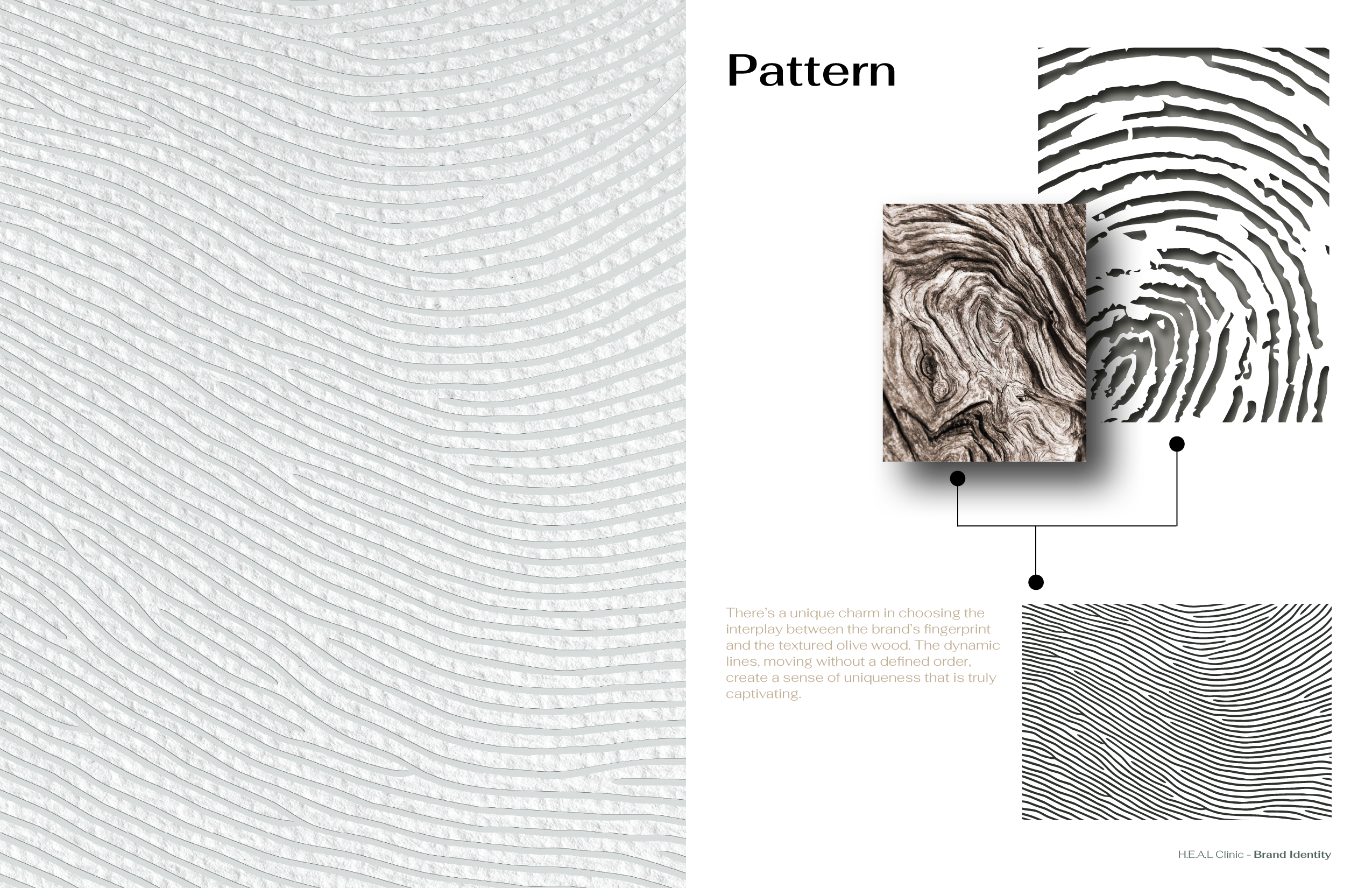
The brand’s pattern is inspired by the elegant outlines of the jellyfish. When repeated, these shapes create a texture reminiscent of water, capturing the freshness and fluidity that Turri Vive represents. This pattern is subtly integrated into various elements of the medical center, reinforcing our connection to the ocean’s life-giving properties.

Online Direction
We developed a focused online direction that effectively showcases the brand’s unique identity while clearly presenting its services. By carefully crafting the content and visual language, we ensured that every digital touchpoint reflects Turri Vive’s core values and aesthetic. This approach allowed us to maintain a strong and consistent brand presence online, while communicating the full scope of services in a clear, elegant, and engaging manner.


Offline Direction


Look and Feel
Turri Vive is more than a medical center; it is a place where every detail tells a story. From the ocean-inspired scents to the harmonious colors and carefully selected music, every element is designed to transport our guests to a tranquil, otherworldly space. The experience at Turri Vive is immersive, allowing patients to feel a deep connection to the essence of rejuvenation.




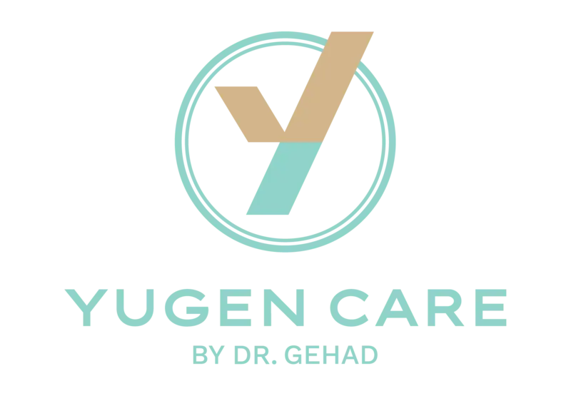
In the unique concept of our logo Y stands for “Yugen”.
The golden tick reveals wholeness in undivided wellbeing and health,
while the circle integrates our global recognition which is the mirror of knowledge and efficiency.

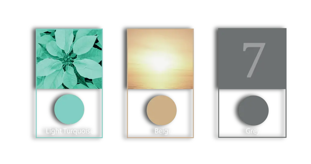
The fundamental symbolism behind our primary colors were drawn from the feeling of the beauty of a single moment.
They resemble the golden rays of the sun as it light up the green hills during the sunset.
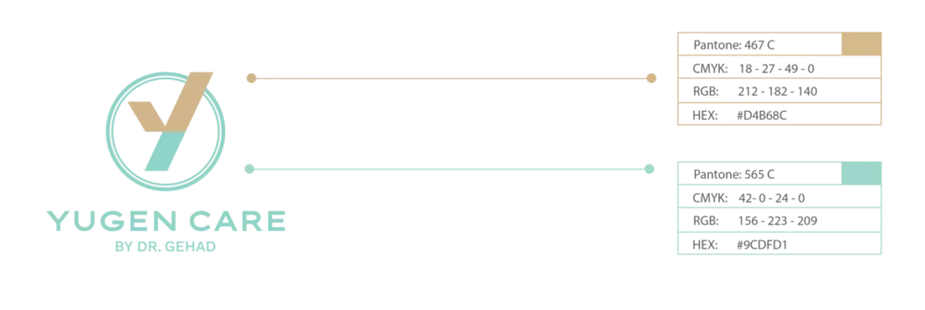
Arranging the logo colors and providing a comprehensive color code guide for seamless implementation across various materials.
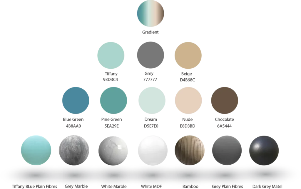
Generating a color palette inspired by the Yugen Care concept, extracting a variety of color shades that complement each other in a harmonious style, and assigning properties to each color. This comprehensive combination includes not only the colors but also associated materials for versatile implementation.
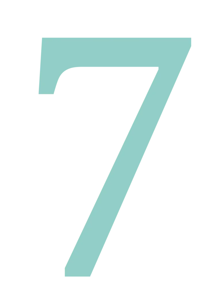
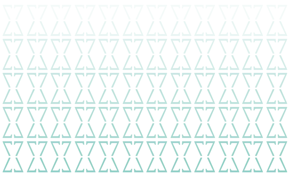
Number 7 serves as the central element for Yugen Care, influencing various aspects such as services, protocols, and more. Therefore, we have chosen this number to create the primary pattern for the brand, ensuring its reflection across multiple elements for a cohesive visual identity.
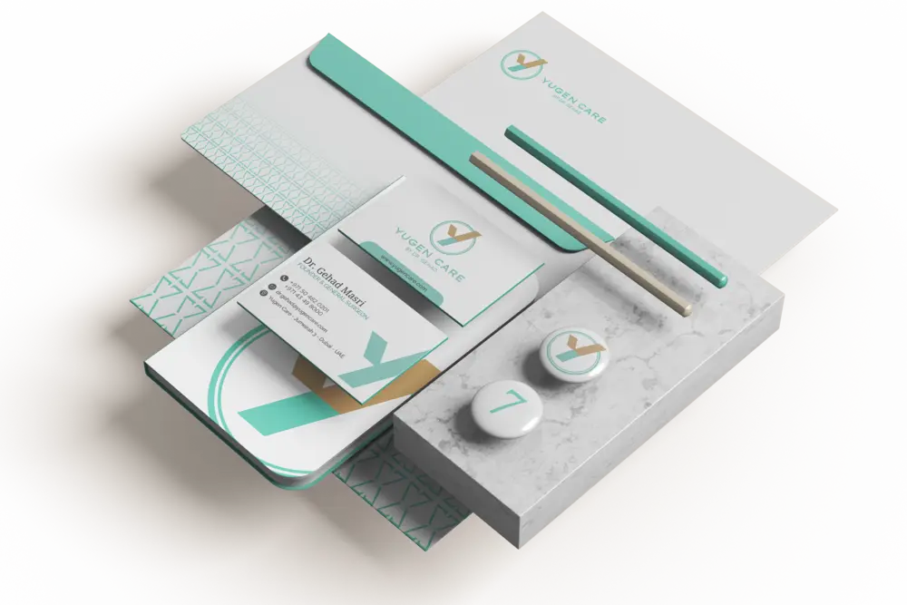
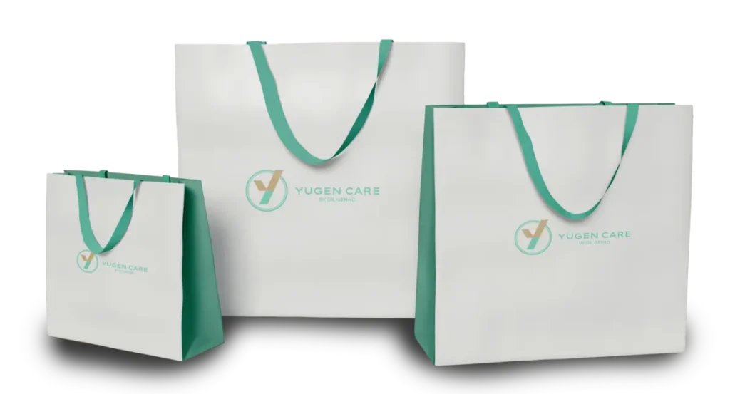
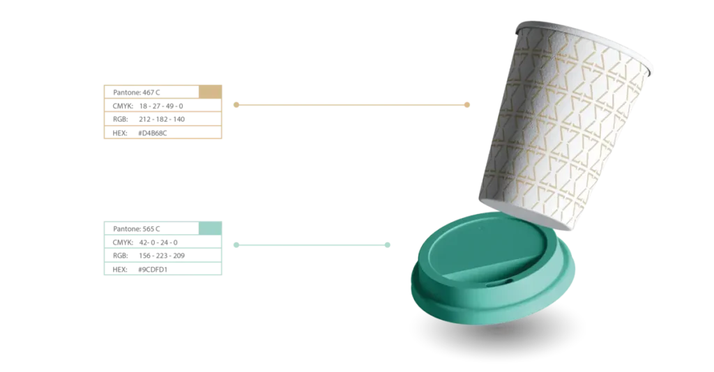
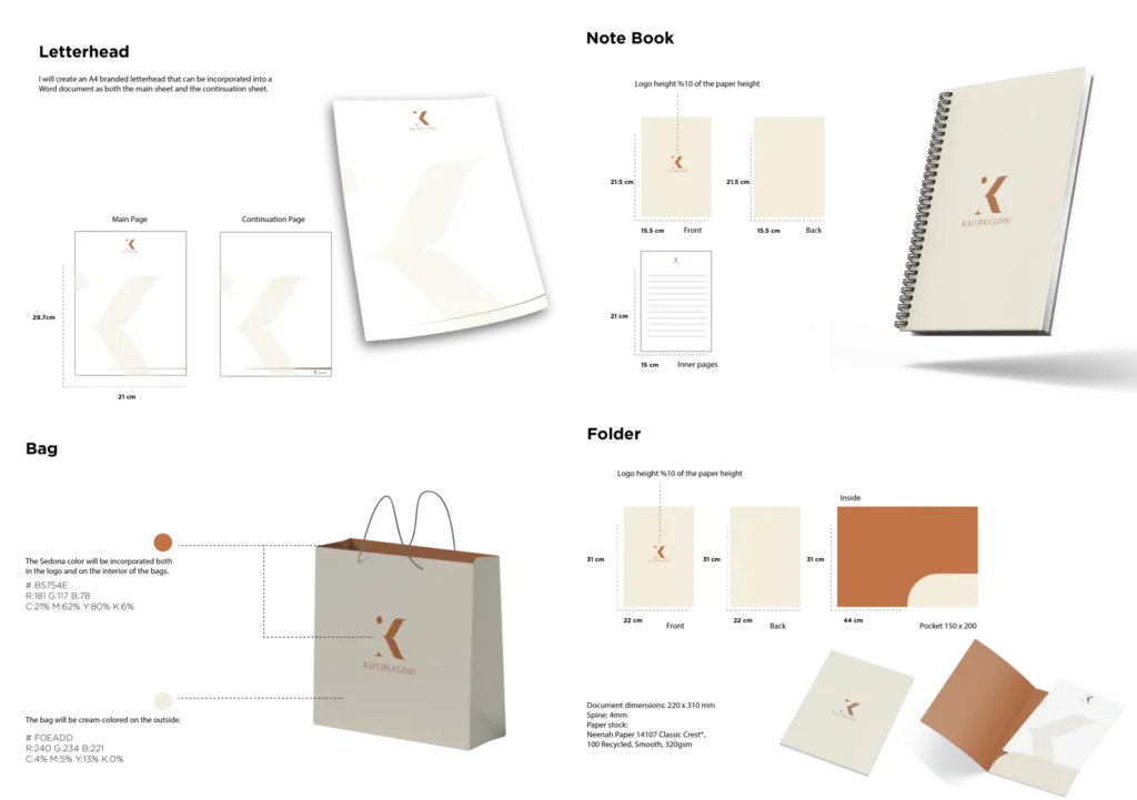
In this project, the stationary phase was particularly successful, addressing the challenge of reflecting the brand on various health sector items in a seamless manner. This encompassed diverse elements such as business cards, folders, name tags, notebooks, envelopes, stamps, letterheads, and more, with a deliberate effort to avoid repetition and ensure an engaging and cohesive representation of the bran
Programs
Services
Packages
ETERNITY
To establish a robust online presence for the brand, the online appearance must align seamlessly with the brand’s direction. This consistency not only enhances brand recognition but also fosters a stronger connection, facilitating better positioning and engagement with the audience.
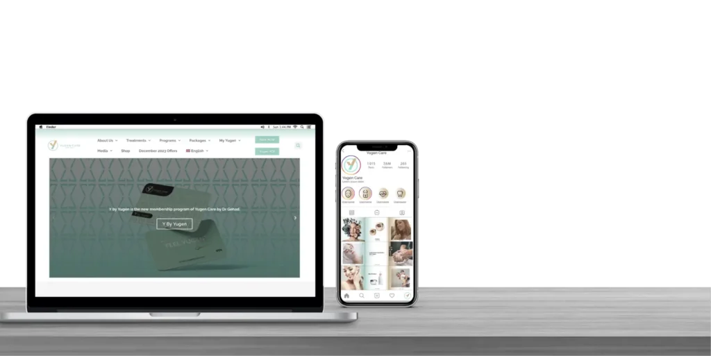
The uniform design phase stands out as a crucial aspect, demanding considerable creativity. It holds significance as it represents not just an item, but the individuals who embody and present the brand, making it a pivotal element in showcasing the brand identity.

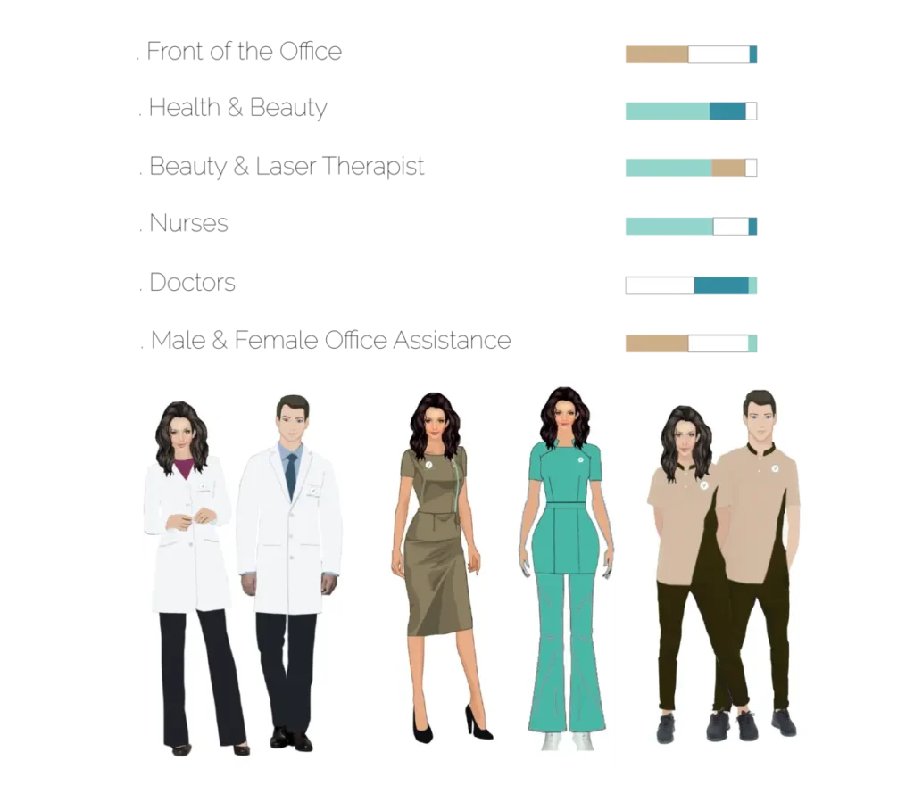

In Yugen Care, the introduction of separate products poses a challenge that requires us to elevate the brand’s maturity by distinctly reflecting the unique value of each product under the overarching Yugen identity
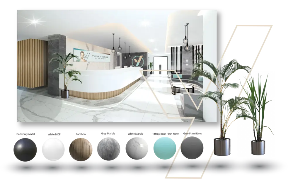
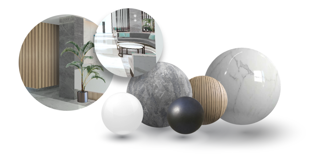
The concept behind this interior is trying to harmonize yugen’s primary and secondary colors with the materials and texture of the clinic. Based on Yugen’s story, 7 elements were picked to be used in the clinic.

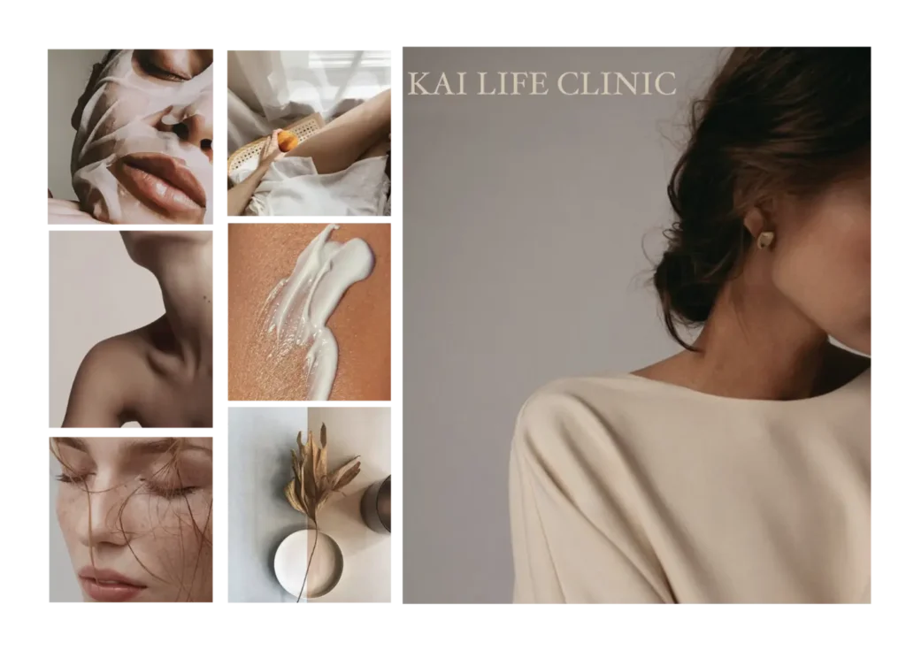
The name “KAI” has different meanings in different cultures and languages. In Japanese, “KAI” means “change” or “transformation,” which reflects the philosophy of KAI Life Clinic to help clients transform and improve their appearance through personalized beauty treatments.
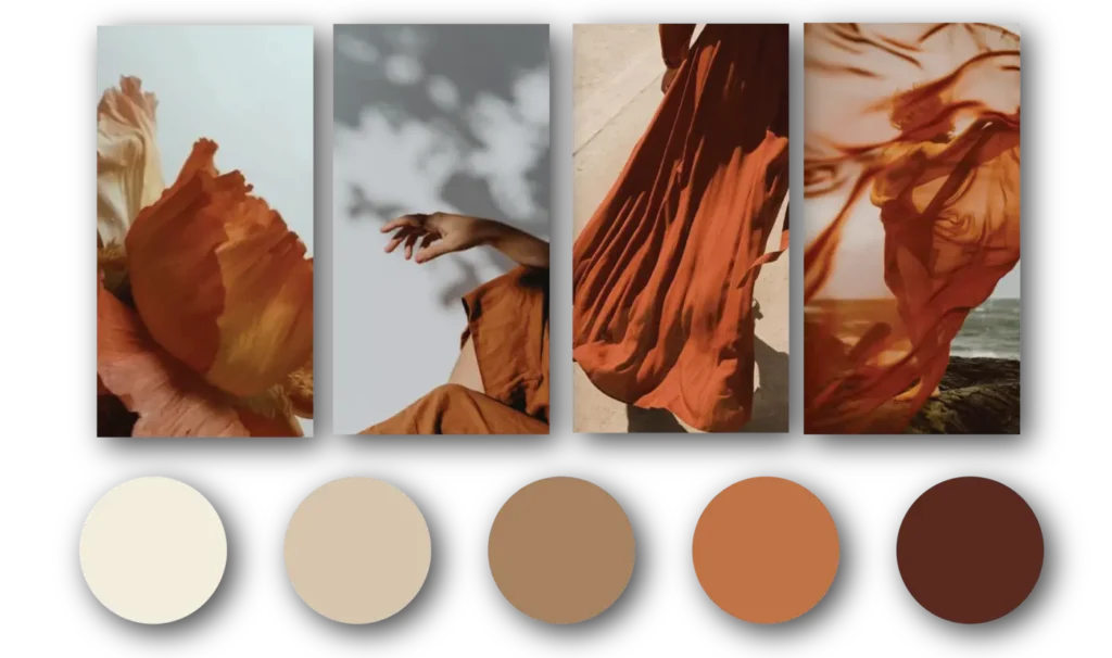
Choosing the right colors is a crucial aspect of creating a brand identity. For a brand that centers around the concept of beauty, empowerment, and comfort in one’s own skin, selecting appropriate colors becomes even more important. In this context, a combination of light beige and brown can be a great choice. Light vreflects the beauty of the skin, while the brown color represents empowerment. Additionally, incorporating a dark orange silk can create a sense of comfort in one’s own skin, completing the overall concept. This color scheme can effectively convey the values and message of the brand, making it more relatable and memorable to its target audience.
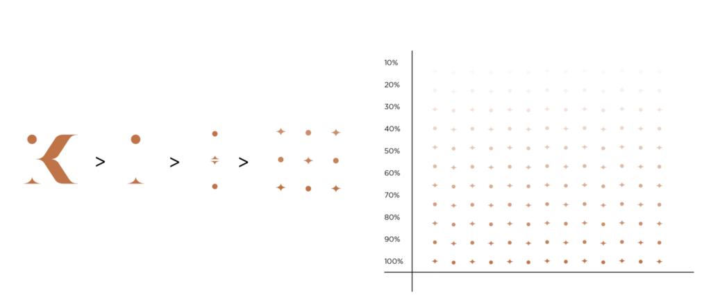
The pattern in Kai Life Clinic emerged as a hero element in branding, seamlessly integrating across various elements to create a cohesive and impactful brand identity.
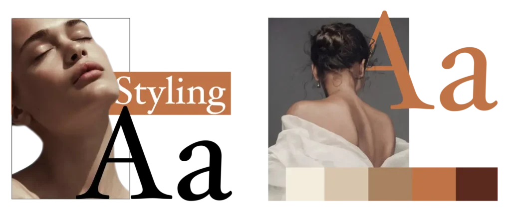
When it comes to presenting a brand, it’s important to pay attention to the details. One of the key elements of a successful brand presentation is the combination of picture and font.
The image or picture used should align with the overall message and values of the brand, while the font should be chosen carefully to complement the image and convey the desired tone. The combination of these two elements is critical in creating a strong and memorable brand identity that resonates with customers and helps establish trust and recognition in the market. By ensuring that the picture and font are combined perfectly, Kai Life Clinic can enhance its brand image and make a lasting impact on its target audience.
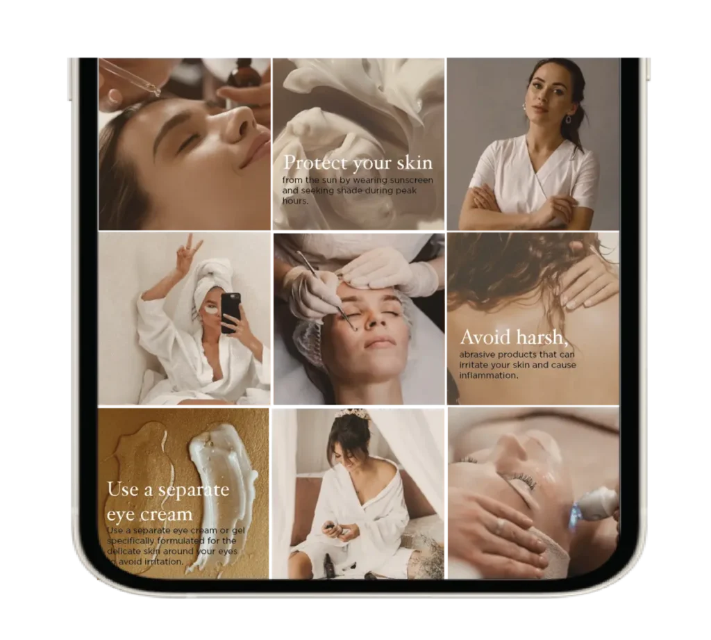
Online…
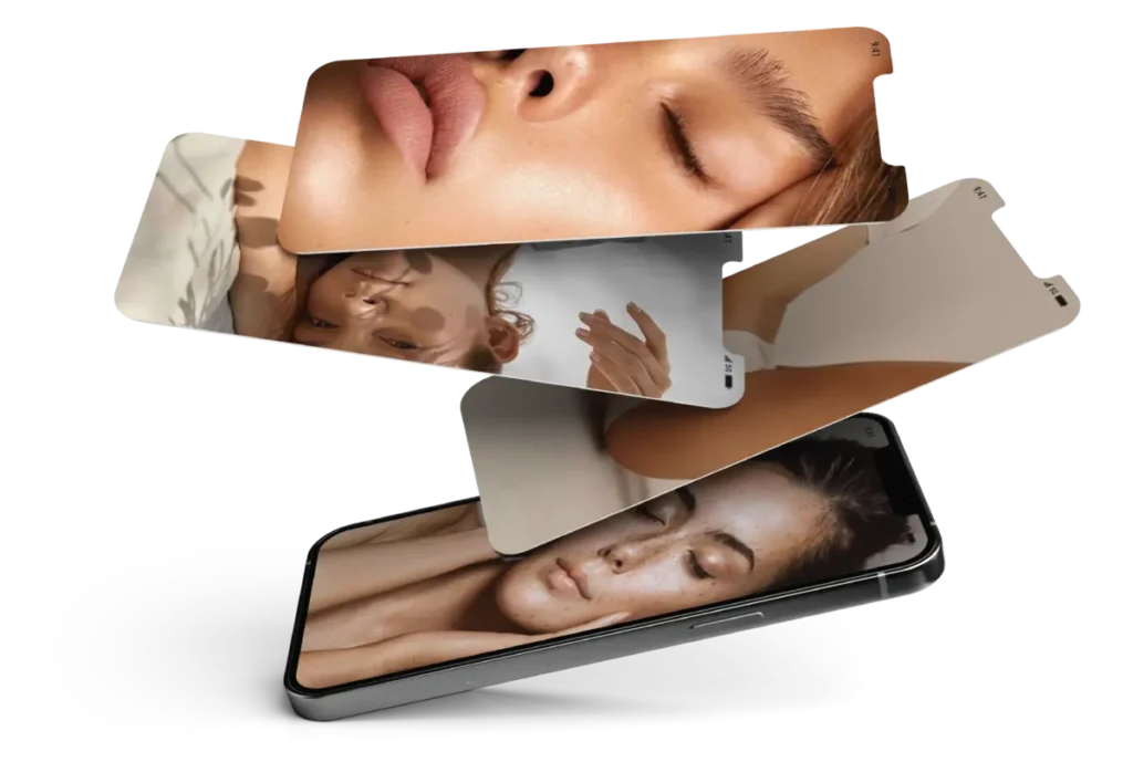
Social media is a great way to build the brand’s credibility
and reputation. When potential customers are researching
the brand, the first place they’ll look is social media to see
what we’re putting out there and what people are saying
about us.
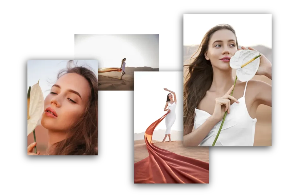
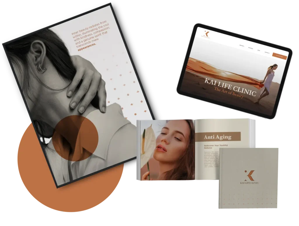
Crafting a brand video for Kai Life Clinic that captures the beauty within the brand and extends its implementation across all materials, creating a 360-degree campaign with a harmonious and unified presentation.
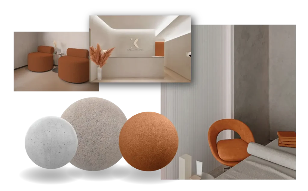
The brand story of our company is intricately tied to the symbolism of the lotus flower and the luxurious feel of silk against the skin. Inspired by these elements, we have chosen a color palette that reflects the natural beauty. Our goal is to create a sensory experience that embodies our brand’s core values of tranquility, sophistication, and rejuvenation.
To achieve this, we are carefully selecting the perfect materials to be used in our clinic. Our materials will not only be aesthetically pleasing, but also have a tactile quality that matches the brand’s essence. We believe that by selecting materials that are both visually and physically appealing, we can create a more immersive experience for our clients, helping them to fully relax and indulge in our services.


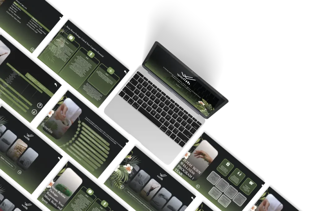
FMC collaborated closely and crafted a corporate presentation that aligns seamlessly with our brand standards, ready to be presented to our customers.
Additionally, this presentation was meticulously created in various formats, including PPT, Keynote, and PDF, ensuring responsiveness to be accessible on all devices.
